Featured Projects

PlanPerfect
About the Company
PlanPerfect empowers nonprofit leaders to create dynamic, collaborative strategic plans through an intuitive online platform. Built by and for mission-driven organizations, it makes professional planning accessible to teams of all sizes—helping them set clear goals, engage stakeholders, and measure progress with confidence.
Brand Direction
The brand positions PlanPerfect as a disruptive yet approachable alternative to traditional consulting. It emphasizes empowerment, inclusion, and adaptability—reflecting a shift from static, consultant-led plans to a living, collaborative approach. The tone is professional, encouraging, and aspirational, grounded in the belief that progress—not perfection—is what drives impact.
Logo & Visual Identity
The owl mark, created from two back-to-back “P”s, symbolizes wisdom, insight, and collaboration. Rounded typography mirrors the owl’s form, creating cohesion and approachability. The mint, navy, and lime palette balances clarity with optimism, while modern sans-serif fonts convey professionalism and accessibility. Together, the system represents a brand that’s intelligent, trustworthy, and inviting.

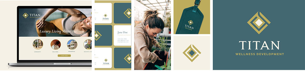
Titan Capital Investments & Titan Wellness Development
About the Company
Titan Capital Investments & Titan Wellness Development is a vertically-integrated real estate platform that spans two complementary arms: the investment side — acquiring, developing and operating real estate assets for superior returns — and the wellness side — creating purpose-built environments that enhance quality of life through innovation, design and well-being.
Brand Direction
The brand positions Titan as a dual-force: financial strength meets human centric development. On the investments side it is authoritative, disciplined and return-driven. On the wellness side it is visionary, holistic and impact-oriented. The overall tone bridges these with clarity, integrity and a premium edge — conveying that Titan doesn’t just build assets, it builds enduring value for people and place.
Logo & Visual Identity
The logo and visual system reflect these twin arms through a unified mark that conveys strength, balance and growth. The capital investment arm is communicated with structured geometry, bold typography and a refined palette that conveys stability and profit-focus. The wellness development arm introduces softer accents, lighter tones and more open forms to reflect wellness, vitality and human-centered design. The combined system signals a firm that is both disciplined and inspired, both grounded and forward-looking.

BEAT Financial Services
About the Company
BEAT Financial Services offers comprehensive accounting, tax, bookkeeping and business-consulting services, supporting both individuals and businesses so they can focus on growth while knowing their finances are handled.
Brand Direction
The brand is positioned as a trusted partner for progress and success, emphasizing clarity, reliability, and proactive financial insight. BEAT stands for accuracy, confidence, and moving businesses forward—not just keeping up, but getting ahead.
Logo & Visual Identity
The logo features upward-trending arrows symbolising growth and financial success, with gold as the key color reflecting value and wealth. The design supports the idea of “the individual + their business + the accounting firm ” working together and nothing falling through the cracks—reinforcing trust, precision and a progressive mindset.